Review: Booksteam

If you’ve been reading for a while, you might remember that I did a review of Booksteam a few years ago – they got in touch to let me know they’d added several new features and see about doing an updated review, so here that is:

Overall, I’d recommend Booksteam for a service provider that needs something more full-fledged than Calendly or similar scheduling solutions and wants an end-to-end booking/payment solution that can be easily embedded or shared online.

Notes:

  • Pricing: Free 14 day trial, with paid plans starting at $20/month
  • Platform: Web, with a mobile web version
  • Integrations: PayPal, Stripe, Squarespace, MailChimp, WordPress, Wix, Weebly, Twilio, Joomla, Yola, Jimo, Facebook, Google

More details on some of the advanced features mentioned in the video: 

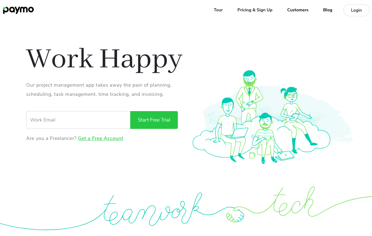
Review: Paymo

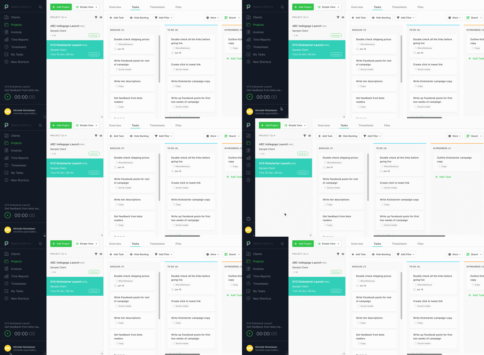
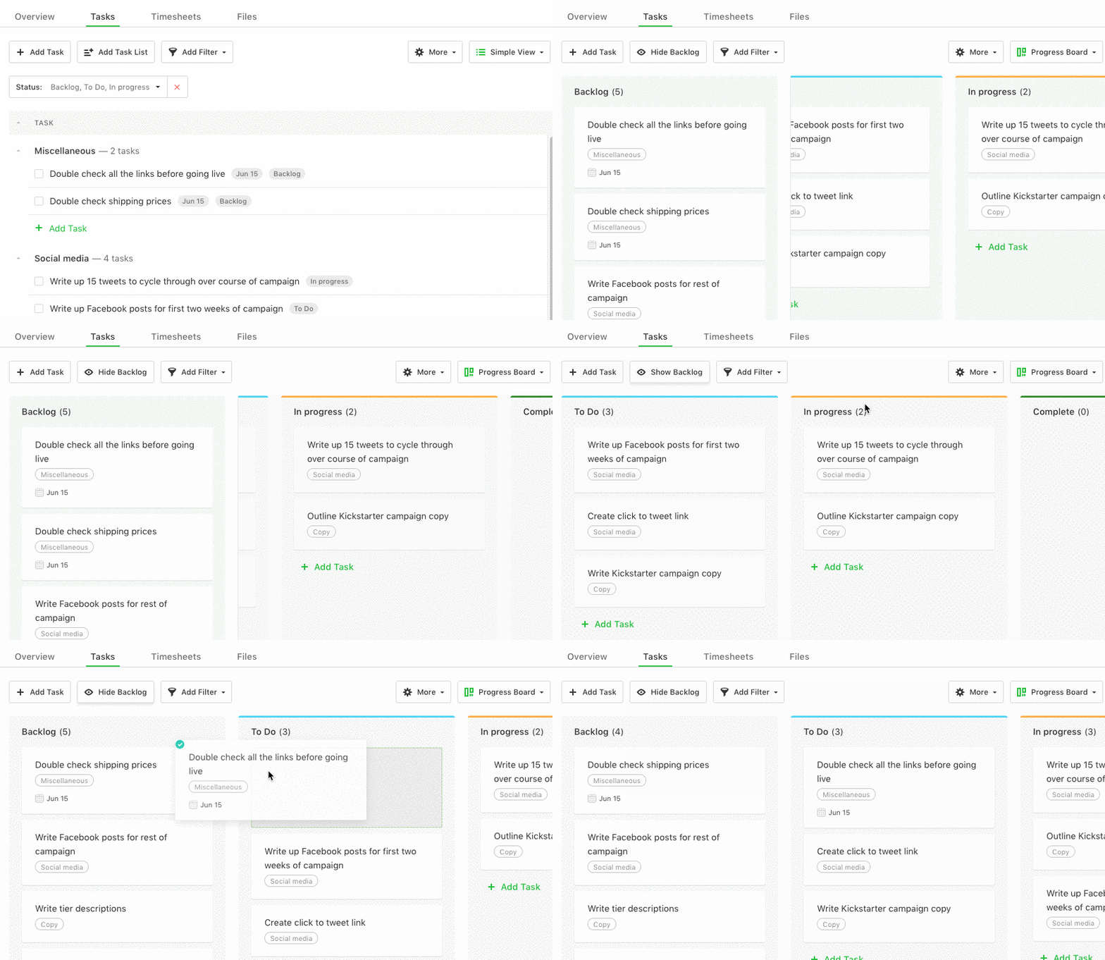
Paymo is a project management tool which aims to help  small business owners and freelancers manage everything related to their projects — from onboarding a new client, to planning and scheduling tasks and resources, and of course, getting paid. It has the standard project management features (projects and task lists, team collaboration, time tracking), with a few additional ones  too. One example: at every plan level, you can switch to a Kanban view with a few clicks to see where all of your tasks are at. There are also built-in time tracking tools (many project management tools integrate with time-trackers, either naturally or via Zapier, but PM tools that have built-in time tracking are harder to find). If you’re a service-based business owner (whether you’re a freelancer, running an agency, or somewhere in between), the extra features that are built into Paymo could make it your one-stop-shop as far as productivity apps go. 

The full-featured plans, which are geared towards agencies and teams (vs. freelancers), allow you to access an advanced task view with filtering options to view all task details more conveniently, use resource scheduling tools to keep track of your team’s capacity and bookings, and view Gantt charts with drag & drop functionality (and the earliest date of project completion automatically calculated for you). To see it all in action, make sure to watch the video review above! Here’s the notes:

Platforms: Web, Linux, Mac, Windows, iOS, Android

Price: Free for freelancers, starts at $9.56/user/month for teams (or access to features like invoicing/estimate features, project templates, advanced reporting, and integrations)

A few quick notes on the video:

  • You can click on the small arrow on the lower left hand of the screen (next to your username) to minimize the side menu
  • I talked about customizing workflows around 5m in, which you actually can’t do with the free subscription
  • The Adobe CC extensions are available for all plans, including the free one

Paymo is good for you if:

  • You need the ability to easily switch between Kanban and task list views (or other people who work on your team do).
  • You want an integrated spot to see all of your tasks and how much time you’re spending on them (vs switching between your project management tool and something like Harvest). This feature would be especially useful for freelancers who are starting to switch over to an agency model — brings  all the task, productivity, and billing metrics under one roof
  • The resource management features (only available on the small business plan and up) would help you stay clear on where time/resources are going — even as a freelancer, several of these would come in handy; if you’re working with a team and you’re a visual person, these would be super helpful.
  • You need an easy way to be share timesheets with clients (you can generate permalinks for time reports for each client, so they can see where hours are at without having to check with you). Also good for you if you want to be able to customize your reports and add visual metrics (to show them where most of the billable hours are being spent, for example).

Standout features:

  • Easily alternating between Kanban (board) and lists of tasks — most apps (including Asana) only let you see one or the other.
  • The desktop widget and Paymo Plus (an automatic time tracker) are great for people who need automatic time tracking or spend a lot of time working without a reliable internet connection. Paymo Plus is especially intriguing — you just start it, then let it run in the background, and all you have to do at the end of the day is match the app/window title to the project/task you were working on for it to automatically create a timesheet for the day. Think Rescuetime, but with a direct link to invoicing.
  • The Adobe CC extension, which gives you a widget to track, view, and edit time entries while working within Photoshop, InDesign, InCopy, Illustrator, or Premiere. Very useful if you spend a lot of time in any of those apps and want to seamlessly track your time, without switching between the app windows

[Disclaimer: This was a sponsored post, which means that Paymo got to jump my review backlog, have their review published faster, and take a look at the review before it went live.]

Review: nTask

nTask is a task/project management platform that has some interesting features you don’t usually see in task management tools of this style – watch the review or read the notes below to find out what they are!

Platforms: Web, Android (in beta)

(You can get a free year of nTask here!)

Good for:

  • This would be great for freelancers, but would also be great for small teams or especially agencies (people who need to keep track of time per project or client and want one unified interface for it).
  • The risk management features would be good for people who don’t naturally keep potential risks in mind while planning (IME, this is almost everyone without a project management background!) and for training you into thinking of those as you plan.
  • The issue feature is probably going to be a big draw people who work on software.
  • Someone who wants a more high-powered alternative to a Trello or Asana style tool, without having to sacrifice good design (once you start looking at task + project management tools that also include Gantt charts, design usually takes a nosedive!). If you miss things like prioritizing, progress tracking, etc., or want to log times associated with specific tasks without using a separate tool like Harvest, nTask could be a good bet.

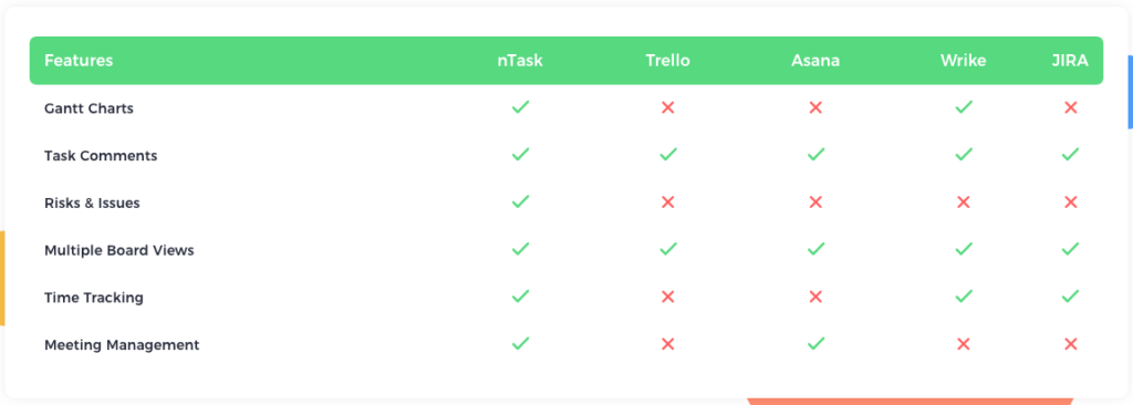
Here’s their comparison chart with a few other popular task management tools:

Standout features:

  • Meeting features: The biggest difference in the meeting functionality compared to something like GCal is that you can create a detailed agenda, store meeting minutes, and automatically share it with a project team, without ever leaving the app. (Note: I said in the video that I couldn’t accurately test meetings because I didn’t have a team set up yet; the nTask team let me know that the meeting functionality works whether you’re a solo user or team user and that it supports Gmail, Outlook, and Yahoo Mail.)
  • Timesheets: You can log times for task/project (and set it to auto-log the hours associated with meetings created inside nTask), and review/track/approve all the hours at a glance.
  • The aforementioned “extras” like Gantt charts, progress metrics, risk management, and issue management. Most of the time, tools with these features aren’t solopreneur friendly and are either badly designed, expensive, or both. nTask could be a good option for you if you’re looking for an alternative and you really want one or all of these features.

How to get past the “screw this” stage of creativity

I’ve been working on becoming a better artist for a few years now, and oftentimes, it feels like an uphill battle through molasses, with cold snowy wind blowing in my face.

But sometimes, I have a moment of clarity:

Big difference, right? There’s two years of practice between those two drawings, and you can tell. Over those two years, I drew as much as I could — often every day, sometimes just once a week — and experimented with new mediums and styles.

However, I can also say that a lot of my growth comes down to one small change I made in my drawing practice, that made a huge difference:

Learning to spend more time on one thing.

Both drawings are the same size, 5” x 8”. The drawing on the left, I probably spent 30-60 minutes on. The one on the left took 2-4 hours.

“Wait a minute, is this another 10,000 hours riff?”

Nope — I don’t mean that you need to spend more time every day, or even more time in deliberate practice. (Although both of those things are also key.) What I mean is that you need to learn to spend more time on one project, using the skill that you’re learning.

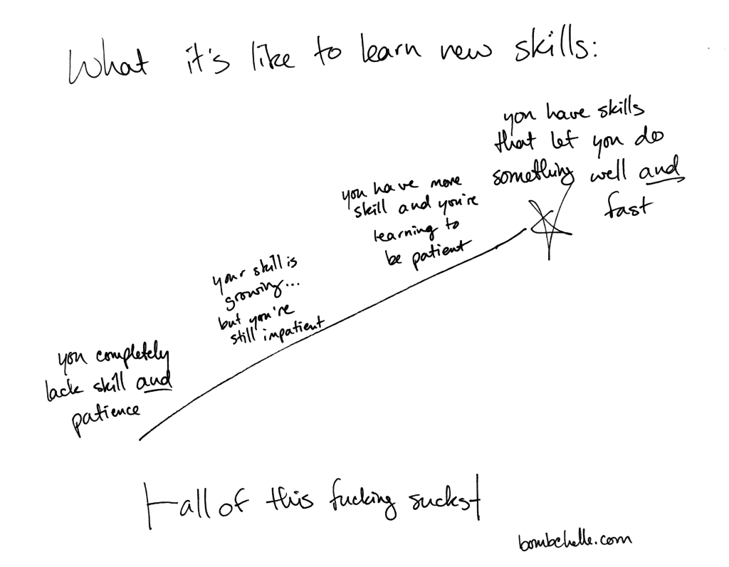
There’s a learning trajectory with creative skills that looks a lot like this:

  • When you first start, you have no skill and no patience. You spend an hour working on an article/painting/scarf/dress and then you get frustrated and throw it away or hide it, so you never have to look upon its hideous visage again.
  • After some period of time and regular, deliberate practice, you have a small amount of skill…but still pretty much no patience. You’re improving, but it’s sooooo slowwww that it’s basically imperceptible (at least to you).
  • Eventually, your patience starts to match your blossoming skills, and you start spending longer on individual projects/pieces.
  • And then, and only then, do you start to reach the point where you can create something well and do so without spending as much time on it.

In my experience, it’s actually harder to hold on throughout this arc if you already have one skill at the “top” — especially if that one skill has been a constant for a good chunk of your life.

For me, I always want to compare whatever skill I’m working on, whether it’s drawing, jiu jitsu, learning German, you name it, to writing…but I’ve been writing for so long that literally nothing compares to it. I’m already at the top of the arc with writing, when I’m way over at the bottom of the hill with the new skill. Often, comparing these two skills makes me even more impatient and less likely to spend a long time on one project, even though it’s a fundamentally flawed comparison.

What you learn from spending more time on one thing:

You learn shortcuts.

We all want to get to the point where the creative work takes less time. The problem is, you can’t get there by continuing to spend an hour or less on a project and saying it’s done. Every time you spend a little longer working on something, you realize new things, like seeing a faster way to outline an article or that these two mediums blend together exceptionally well.

The only other way you’re going to learn those shortcuts is by talking to other people, taking classes, or reading/watching tutorials. Even then, you’ll still have to try it and experiment and see how it works when you do it.

You learn to push through the ugly middle.

Learning shortcuts is great, but this is the real gem. When you don’t spend enough time on any one project, you stop before you ever hit the ugly middle.

You know the ugly middle, right? That part of the project where you’re like “WELP I guess I better just burn everything to the ground because all of this is terrible and I am a fraud and I will never create anything worthwhile, it’s time for me to fulfill all the stereotypes about creatives and booze”? Yeah. That.

When I was just doing 10-15 minute sketch sprints every day, I was improving, but I also never really hit the ugly middle of a project. When you start working on a bigger or more involved scale, there is always an ugly middle, even if it exists more in your head than on the page. Spending longer on individual projects teaches you how to recognize — and then push through  the ugly middle.

A big part of the reason it’s easy to avoid spending a long time on a particular project is because it’s downright painful to spend so much time on something and have it still be far from perfect — as Ira Glass puts it,

Nobody tells people who are beginners — and I really wish somebody had told this to me — is that all of us who do creative work … we get into it because we have good taste. But it’s like there’s a gap, that for the first couple years that you’re making stuff, what you’re making isn’t so good. It’s not that great. It’s really not that great. It’s trying to be good, it has ambition to be good, but it’s not quite that good. But your taste — the thing that got you into the game — your taste is still killer, and your taste is good enough that you can tell that what you’re making is kind of a disappointment to you.

And I get it. It sucks.

But if you stick it out, I bet you’ll be surprised at the results.

Your homework: For one of your still-improving skills, spend twice as long as you normally would on one piece/project/whatever. Start doing that on a regular basis, without neglecting your regular practice. See what happens.

For the love of everything good and holy, read this before you send your next PR email

As a PR professional, you’re busy. I understand that. I also understand that you’re probably being forced to do at least some of these things by your boss. Or that you’re working on a budget and marketing your own product, and somebody told you these tactics work.

Butttt….

These annoying, time-wasting emails have to cease, ASAP. On behalf of everyone on the receiving end of them, I’m begging you: Please. Stop.

Read this post. Fix your next batch of PR emails. Save time by not sending useless emails that don’t get results and infuriate the recipient.

Here’s what you need to know to do that:

All bloggers/writers are not the same.

I don’t know if this is an old-guard vs new-guard (is “new guard” a thing?) PR issue, but I regularly get pitches that are for “newsworthy” type topics. Things like “this company released a new product” or “we’re hosting a conference” aren’t super relevant to me as a writer, since I never write news coverage.

Similarly, someone who does short write-ups of local events doesn’t want to be pitched on your app. And someone who writes about social media trends doesn’t care about your CEO’s philanthropy.

While we’re at it, please stop sending emails that have no actual information in them and say to refer to the attached .doc press release. It’s not 1999, I don’t want to have to fire up Word just to know what your email is about.

Do your research.

Once, somebody emailed me wanting me to review their educational app for 3–5 year olds. My entire YouTube feed is reviews of business-related apps, mostly productivity/project management apps for freelancers. That pitch is so far off base, it’s not even in the same ballpark. It’s like three miles away from the stadium in the warehouse district.

We don’t want to get form emails.

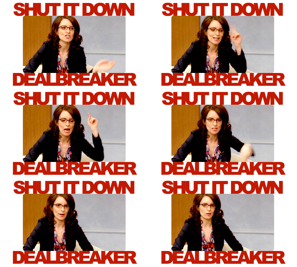
I have never opened an email that started with “Hi,” then immediately segued into a copied-and-pasted pitch, and reacted like so:

I’m pretty sure nobody else has, either.

I know you’re busy, but the very least you can do is put a name in the email. The next (tiny) step up would be telling the recipient why you think this is relevant to them. It won’t kill you.

Stop with the excessive follow up.

If a writer didn’t reply to your first three emails where you mass-pitched with a copied and pasted email, they’re probably not going to reply to your fourth email. Or write something about you/your company. Stop wasting their time (and yours).

Don’t argue with us.

In one very memorable incident, which has been duplicated to lesser degrees since then, a company (which we’ll come back to in a moment) pitched me on their app via Twitter. I replied & said it wasn’t a good fit for a review, since it didn’t look like it was intended for freelancers (my primary audience for reviews).

This marketing person then proceeded to argue with me on Twitter about how freelancers would want/use a tool that was $50/month…so they could use Gantt charts.

Needless to say, I was not sold by somebody I didn’t know lecturing me about what would be relevant to me and my audience.

Whoever you’re pitching is the expert about what’s relevant to their audience and what performs well for them. And in our online, metrics-driven world, if something doesn’t do well, there’s often repercussions, ranging from time wasted to getting a lecture from their boss/client. If they say it’s not a good fit, leave it alone.

We’re all busy and nobody wants to work for free.

Somewhere along the line (maybe with Ryan Holiday?), this myth started that all bloggers, everywhere, are just waiting to be handed content by PR folks. We spend all day anxiously staring at our inboxes, keyboards at the ready to instantly turn your press release into a blog post.

It probably doesn’t need to be said, but: this is not true. (Or rather, it’s only true for a very specific subset of writers who do a specific style of writing—refer back to point one.)

Everyone you email is busy, and when you send them a totally irrelevant pitch email, it feels like you’re wasting their time. When you send them a totally irrelevant pitch with an air of entitlement, acting like they’ll be super-grateful for the chance to cover your event/app/whatever, it can be downright infuriating.

When you email writers asking them to…

  • review your app
  • edit an old article (on a client site, sigh) to mention your app
  • write anything that isn’t specifically client work

Remember: you’re not the one paying us.

As a rule, writers don’t owe you anything. Getting pissy when we turn you down, or when we take a few days to reply (because we have to wade through a slew of time-wasting emails) is just bad form.

Stay organized and stop the stalking.

Remember that company I referenced above, the one that argued with me on Twitter? That wasn’t even the end of it.

Over the course of a few weeks, that company:

    • Sent me a form pitch email
    • Took over two weeks to reply to my reply to their form pitch email
    • Left several spammy comments on articles I’d written around the web, clearly written by marketing people for this app, suggesting I look into reviewing it
    • Argued with me on Twitter about how I should review it
    • Said they’d set up an account with a test environment for me to check out (but didn’t actually do so)
    • Last but not least, emailed less than a week later asking when the review would be live (not if I’d decided to review it—when the review would go up)

Aside from this being a case study in what not to do at every turn, it was borderline creepy. It made me wonder if anyone at that company ever spoke to anyone else there. And it could have been prevented so easily.

This is why there are approximately a million and one CRM apps out there specifically intended to prevent scenarios like this. Make your team start using one and stop stalking writers. (And don’t reward “persistence” like that, because you’re probably just really pissing people off.)

Now that we’ve covered the don’t’s, let’s talk about the do’s:

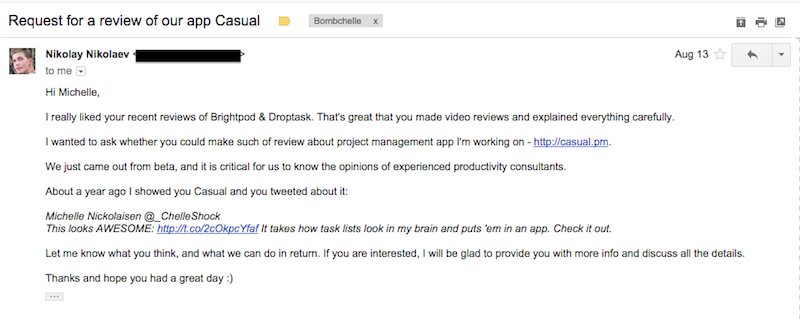
This example from Nikolay at Casual, is well over a year old, but I keep using it because it’s such a great example.

A step by step of why this worked:

      1. Clear subject line. Like everyone, I get a lot of email. It’s a pet peeve of mine when a pitch email is disguised as something else via an unclear subject line (whether it’s intentional or not). If I can’t tell what it is without opening, I don’t want to open it, and I’m already annoyed when I do.
      2. His opening sentence shows that he’s actually checked into my recent review history and the type of content I do. This clearly isn’t a bland copied and pasted pitch email, which automatically endears me to him. Nobody wants to feel like they’re on the receiving end of a form email.
      3. He nicely asks for a review. Which is the whole purpose of his email.
      4. He politely reminds me that I had previously mentioned them. Which sparks my memory and makes me think, “Okay, if I liked them before, they’re probably actually a good fit for my audience.”
      5. And he closes on a friendly but professional note.

I reviewed Casual a few weeks later (the video now has over 2,500 views) and he followed up with a thank you note, along with retweeting some shares of the articles.

This is an industry specific example, but there are universal takeaways:

      • Use a clear subject line.
      • Keep your email short & sweet.
      • Research who it is that you’re talking to, and tell them why you think they’d be interested.
      • Remind them of any previous interactions (should they exist) so the writer knows who you are.
      • Don’t use form emails, or if you do, at least modify them for the recipient.

Other good rules of thumb:

      • If the writer replies with questions, reply back ASAP. We’re all on deadlines. If you take four days to reply, don’t be surprised if they move on to a different topic/source/whatever for their article.
      • Include enough information that the writer can tell if it’s a good fit without having to ask for more information. You don’t want to give them a 1,500 word pitch, but summarize it in a few sentences with a link to someplace they can get more information.
      • More tips here: Give good quote: how to make it easy for people to feature your business
      • Finally, just don’t be a douchebag. The internet has enough of those already.

And that’s how it’s done, folks.

Now go forth and send better pitches.

Featured image credit: via 

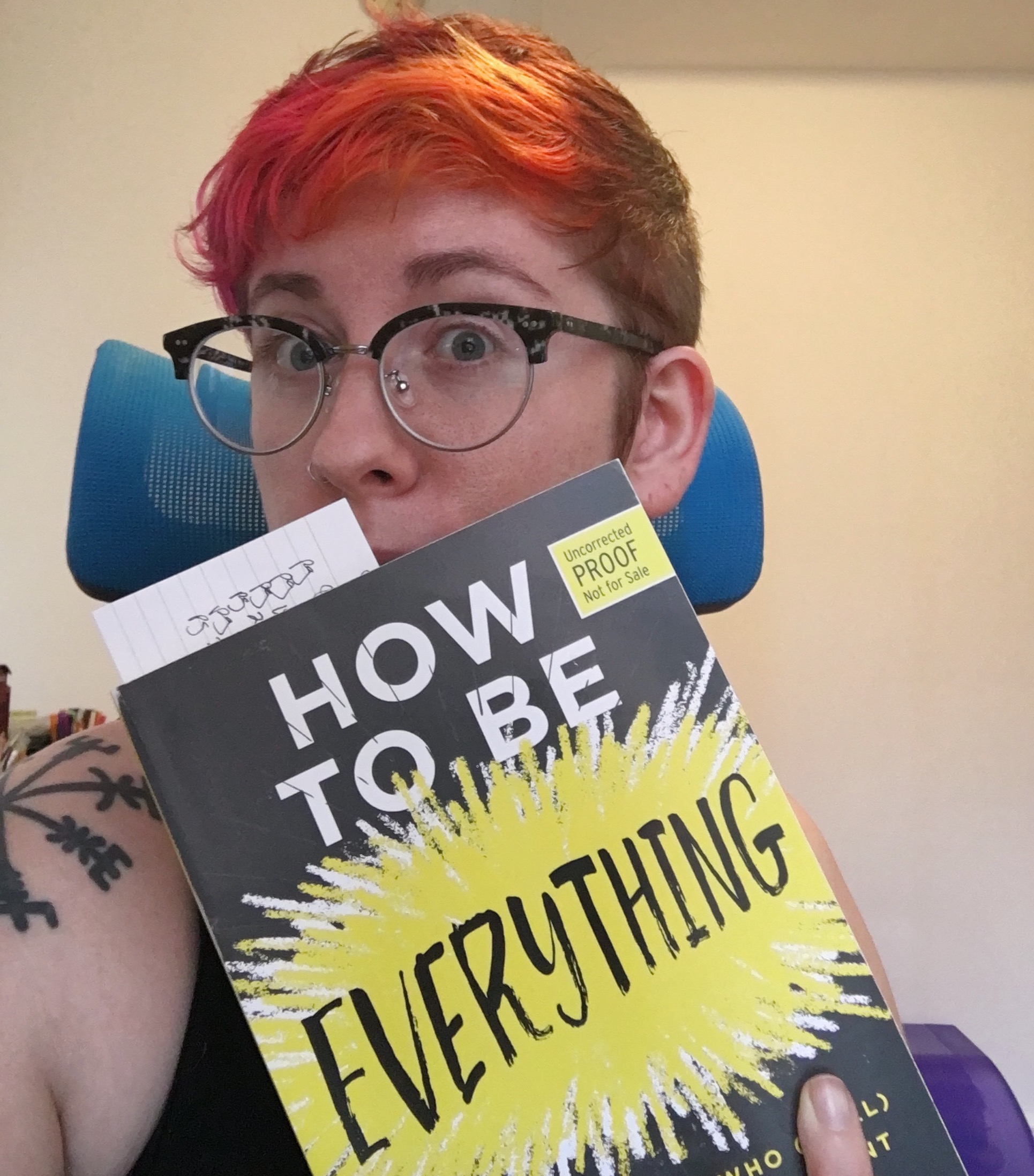
Review: How to be Everything

You might be familiar with Emilie Wapnick from Puttylike, from one of the courses I’ve worked on with her, or maybe you’ve seen her TED talk:

What you might not know is that she has a new book out: How to Be Everything: A Guide for Those Who (Still) Don’t Know What They Want to Be When They Grow Up. If you’re one of the Renaissance souls, polymaths, or multipotentialites (as Emilie puts it) that’s often left high & dry by standard career/life advice, you’ll love it. 

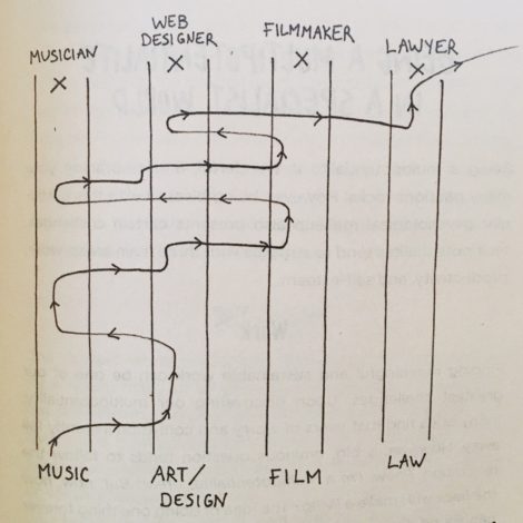
Example career path of a multipod – look familiar?

Here’s a few things you have to look forward to in the book:

  • Why the 10,000 hour rule isn’t all it’s cracked up to be
  • The strengths we can lead with, including idea synthesis, rapid learning, and more
  • How you can use your interests to lead you to innovation
  • The specifics of lifestyle design for multipotentialites
  • …and a lot more, including productivity tips & how to explain your many interests to people who just don’t get it

What I really appreciate about Emilie’s approach is how grounded and practical she is. A lot of the older books on Renaissance types focus on reassuring people that they aren’t broken and re-inspiring them. Maybe it’s the narcissistic millennial in me, but I’ve never been super concerned about that. Instead, I wanted to know how to make things work for me, in a system that isn’t always built for people with as many projects and interests as I have.

Years later, I’ve got that figured out for the most part, even though I still have my stumbling blocks – but if I had this book ten years ago, it would have been a lot easier to get here. Emilie has managed to combine motivational/inspirational accounts of multipods around the world and throughout history with practical tips on incorporating all of your interests into your life, without getting burned out (or being broke all the time). If you’re struggling with any of those things, I’d definitely suggest you check it out

The side project survival guide: making time to work on everything as a freelancer

I’m one of those people that can’t sit still, always fidgeting and looking for a new outlet, and you can tell from looking at my project roster…in between the novel series, the two audio dramas, the t-shirt collaborations, the planners, writing here, oh and my entire freelance business, I definitely have my hands full. People ask me a lot about how I juggle all of these things, which is a pretty fair question (and, in case you haven’t guessed, the subject of today’s post!).

Whether you’re as, uh, ambitious as I am about side projects or not, learning how to make containers for your time well will serve you as a freelancer.

One of the biggest problems I see is freelancers giving everything they have to their client’s businesses, without leaving in the tank for their business. This is a huge contributor to feast or famine syndrome (since marketing is a big preventer of feast or famine).

So, what do I mean by making containers for your time?

The way my week is set up looks like this: 

  • Tuesdays, Wednesdays, and Thursdays are days devoted strictly to client work. Barring things like morning words or a quick writing sprint on one of my creative projects, I don’t work on anything those days except for client work.
  • Mondays and Fridays are administrative and business development days, when I send emails, invoices, and do follow-up work. These days are also when I work on blog posts and my own creative projects.
  • I also tend to do some breaking up of the tasks based on the time of day – more on that in this post.

Separating my time like this lets me focus on the task at hand and tackle it in the most efficient way possible. There’s also less switching cost because I’m not bouncing around from client work one minute to writing a blog post for Bombchelle the next to working on an audio drama. The context of the tasks is similar, letting me move from one to the next with much less friction.

There are three key aspects of this “container” method:

Communicating with your clients

The way I work isn’t a secret – I list it right out in the open on my freelance site. Sometimes, people think that clients must be irritated by the fact that I’m not available 24/7 to clients. The truth is, you can’t be, to run a successful business, especially if you’re just one person.

[Tweet “Being available 24/7 is a sure path to freelancer burnout. “]

Are there clients that are turned off by my work style? Probably. But if they want to be able to get ahold of me at a moment’s notice within office hours M-F, they’re probably not a good fit for my working style (and, in my experience, the clients that want that ability often have boundary issues in other ways, too).

In reality, most clients really appreciate that I’m so up-front about how I work, understand that it lets me be more focused for them and keeps administrative or other work from distracting me from their work, and appreciate that I invoice on the same day every week. There’s also the side effect that, since I block out time this way, a client can wait to send me research or an outline until Monday and I’ll still be able to get the finished work back to them by Thursday of that week.

I’m sure part of the warm reception my clients have to this system is that I always frame it as benefiting them. Which isn’t dishonest – it benefits them in a lot of ways (all of the above, plus me being able to produce work more regularly since I have a schedule, I’m not burning myself out, and I’m not stressed out about steady income). It just so happens that it’s also super beneficial to me.

Making time for working on your business and in your business

Freelancing isn’t just about doing client work – it’s also about staying on top of the admin and marketing work. You’re always going to have a lead time on projects (ranging from a week to a few months). But when you’re booked out for two or three months, it’s easy to forget that and let up on your marketing.

If you haven’t been marketing, when you hit the end of those bookings, you’ll have to start from scratch – which means you’re looking at anywhere from a few weeks to a few months without income. No bueno.

Blocking out your work this way allows for working on your business, and makes it almost impossible not to. (Unless you’re so booked up that client work is bleeding into your internal business days…in which case, raise your rates!)

Allowing time for creativity

When things get busy, it’s easy to let my creative projects fall to the wayside. But with this container method, I have time already set aside for creative work, which makes it much easier to fit in.

I’m a big believer in doing work that’s personally fulfilling, even if it doesn’t have a hard ROI. If you’re a coder, that work could be an app or game that you’re building. If you’re a writer, like me, it might be a novel or a podcast. Even though these projects might never make any substantial amount of money, they give me inspiration and energy that transfers over to my “normal” work. When I’m working on my creative projects, I’m a happier, more focused person the rest of the time…so it does wind up helping my client work, in its own way!

All told, separating my time into these containers makes me more productive and fulfilled. Instead of being forced to multitask and jump between completely different tasks, I get to give focused attention to everything I do – letting my main business and my side projects thrive.

photo via Luis Llerena at Unsplash

Better habits roundup: The tools helping me beat writer’s block, stay on top of taxes, & more

It’s been a while since we’ve done an app/tool roundup here, and I thought it was high time to dig into some of the things making a big difference in my life lately. In this edition: tools to wrangle self-employment taxes, track & manage anxiety, beat writer’s block, and setup your e-commerce shop in ten minutes. 

Let’s get down to it:

(image via Vitaly at Unsplash)

Tackling self-employment taxes

Like many self-employed people, the thought of taxes fills me with dread. My past tax rituals have involved putting it off until the last moment, filing an extension at the last moment, forgetting to file an extension because of some urgent matter and then filing my taxes six months late and paying the exorbitant fees…you get the idea.

This year, I really wanted to have my tax game down pat. Given that I’m almost a decade into this freelancing business, I think that’s fair!

This year will be the first year I’ll have everything in order enough to file and pay taxes quarterly, and it comes down to two tools:
  1. Qapital
  2. QuickBooks Self-Employed

(Having a healthy/steady client base is also a factor here. This is the first year when I’ve had enough steady income to be able to set aside money without it having to go to rent or other living expenses. Which is not to brag on my business, but more to say if you’re not here yet, that’s totally okay & it’s not because you’re a failure or a bad person.) 
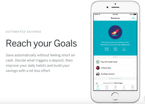
Qapital is a saving solution that automates your savings based on rules. You can set it to round up to the nearest $2 with every purchase, for example. It also integrates with IFTTT for some interesting results. But, the most pertinent feature is that there’s a Freelancer Rule: every time you get a deposit, Qapital automatically transfers 30% of it to a savings goal. It’s all automatic, and it has overdraft protection rules in place to stop saving when your account dips below $100 – an issue I had over and over again with Digit and Acorns.
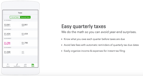
QuickBooks Self-Employed is…well. You’ve heard of QuickBooks. This is a new, lighter version that’s tailored to solopreneur/freelance businesses. The last time I tried to use QuickBooks it was a UI nightmare, but they’ve upgraded their interface, they have a super-simple swipe-to-categorize tool on their mobile app, and you can set up rules to automatically categorize recurring costs.

Best of all: it calculates your tax deductions based on your income and business expenses, letting you know how much you’ll need to pay quarterly (and what date to submit it by).

So far, Qapital is saving more than QuickBooks says I’ll need to pay in taxes. But that’s great, because that means at the end of the quarter I can just roll over anything extra into one of my other goals (like editing for the second Worldslip novel, or audio engineering for one of the audio dramas I’m working on).

TLDR, taxes edition:

Qapital takes 30% of my client payments and transfers it to a savings account for me. QuickBooks categorizes my business expenses and calculates how much to pay quarterly to avoid any nasty surprises next year (and will help me file quarterly when the time comes). They’ve both made wrangling the financial side of freelancing a lot easier.

[Tweet “The recipe for less freelance tax headaches: @qapitalapp + @Quickbooks. More apps for freelancers:”]

Note: Both of these are referral links, which means I benefit if you sign up through the link – I get $5 from the Qapital link and $30 from the QuickBooks link. Of course, you also get a discount too: $5 in your account from the Qapital link and half off your first six months of QuickBooks with the QuickBooks link. Not a bad deal! 
Tracking (and decreasing) anxiety

Less business related, still crucial for quality of life (and also productivity, but emotional well-being is a little more important than that). In case you’re new here, I am a high-strung human being. Quantifiably so, as it turns out, which we’ll get to in a moment. This is a cute way of saying that anxiety and depression are recurring issues I struggle with (and have written about a lot).

They’re currently managed and in remission, respectively, but the only reason they stay that way is because of a lot of mental health hygiene/routines. And, of course, factors that are out of my control. I could have a depressive episode tomorrow despite my best efforts. That’s the nature of the beast and I’ll never tell you that if only you take your vitamins and exercise daily, you’ll be cured for life – that would be both disingenuous and responsible.

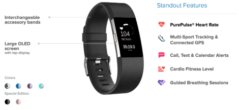
Anyways, a few weeks ago my Alta Fitbit tracker died, and it was still under warranty, so I upgraded to a Charge 2 – which, among other things, tracks your heart rate. And I’m loving having more detailed fitness stats (because I’m basically a gym bro with pink hair), but what I didn’t anticipate was the heart rate tools being so useful for managing anxiety.

A few weeks of tracking my heart rate and correlating it with day-to-day activity has told me:
  • Anxiety is definitely a real thing! (I already knew this, but seeing one of my anxiety triggers ramp my heart rate up by 20-25 bpm is very affirming, in a weird way.)
  • Dogs are magical. (Rain can tell when my heart rate goes up by even 5-10 bpm because of stress and this sets off her “must fix my human” reaction. Also not exactly news, but still kind of interesting to see.)
  • Exercise has a measurable and long-lasting effect that keeps overall stress and anxiety levels lower. I knew this was the case, but the difference if I go 2-3 days without exercise is still quite striking.
  • The most interesting thing so far: doing two things at once is actually much more relaxing than doing one wind-down activity. So far, the best combinations are sketching while watching TV & drawing while listening to podcasts. (The next logical step would be to figure out if drawing is the most relaxing thing, period, but I probably won’t have the attention span to test this because drawing in silence is much less enjoyable than doing it while listening to podcasts.)

Overall, it’s just incredibly useful to have a concrete metric that correlates so closely with stress/anxiety. My therapist noted this as well when I was discussing it with her. It’s so helpful to be able to see “oh, I’m not just being a baby, XYZ thing actually does give me a physical reaction as thought I’d been jogging for fifteen minutes.”

Of course, none of this is 100% scientific – if nothing else, the heart-rate tracker isn’t going to be totally accurate all the time. But it’s still interesting and is another tool in the anxiety-management toolkit.

If you’re interested in getting a wristband for similar uses…

  • The Samsung Gear Fit2 is the cheapest of the heart-rate tracking lot, clocking in around $130 normal price, with decent reviews.
  • The Charge 2 is $150 normal price, but regularly goes on sale for $120-130 – the deals section at Kinja is a good way to keep an eye on that.
  • Woot often has refurbished sales of the first generation of Fitbits, including the original Charge, for around $80.
  • If you want to check out other wearables, here are two roundups: one from Wearables.com and one from PCMag with a comparison table.

(image via Juliette Leufke at Unsplash)

Beating writer’s block

I did so much outlining during January. So. Much. (Like, two novels, two audio dramas, and a game.) The goal: when February rolled around, I’d start knocking it out. This will be the year of epic writing progress, dammit!

And…February rolled around.

And…I got about two thousand words into one of my projects and got stuck.

Like, really stuck.

And then I got in my head about being stuck and couldn’t decide if it was because the project sucked and the story structure was inherently flawed, or if it was because I wasn’t used to working in script format, or if it was because of the seasonal issues I’ve had (I hate winter and this is my first real winter in about eight years), or if this was the sign of an upcoming depressive episode, or or or…

Surprise: This state of mind is not conducive to creativity.

After two weeks of that, it was a struggle to even write client work. I spent another week doing the “woe is me” dance. (I felt especially silly, because I’ve always kind of sneered at writer’s block and viewed it as people being too precious. I’M SORRY, Y’ALL.) Then, I decided the answer was to write something, anything, so I started doing morning pages again and I shit you not, it fixed the problem immediately.  And then I felt even sillier, but I cared much less because I was also feeling victorious after getting ~800 words down on something I’d been stuck on for weeks.

If you aren’t familiar with morning pages…

Here’s a rundown on the practice and the benefits it can have (apparently similar benefits to meditation, which isn’t surprising!). I use 750 words, which is super lightweight, free, and keeps track of your streaks for you. Even if you aren’t a writer, I’ve noticed that clearing all the chatter out of my head in the morning improves my mood and focus the rest of the day – so give it a try.

[Tweet “Stuck in writer’s block? Try using @750words to clear your mind + get unstuck”]
Bonus round: Switching e-commerce platforms

This is less of a habit change and more just an app that really impressed me. Due to being wildly unimpressed with recent statements from the CEO of Shopify, I was looking to switch away from it. Truth be told, I’d been considering switching for a while anyways. In between the Chelleshock Studios shop and the Freelancer Planner shop, I was paying Shopify something like $60/mo and it felt like extreme overkill for what I was getting, especially considering I don’t have that many products in either shop. The planners in particular were essentially two products embedded on a WordPress site. WordPress is still my CMS of choice, and the WordPress-Shopify integration is clunky, at best.

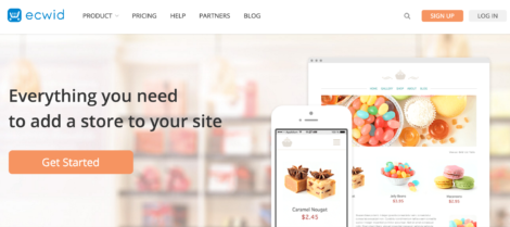
Enter Ecwid.

I was already familiar with them, as I’ve written for their blog several times. They integrate with ShipStation (my #1 lifesaver as a product-seller who ships their own products), and offer a host of other tools and integrations, so I figured they were a good place to start.

And…holy cow, my shop was entirely set up (with accurate shipping costs! something I never managed to configure with Shopify!) in about 30 minutes. There’s a WordPress plugin that makes adding products to a WP site seamless. The user onboarding is also much better. And you can use it for digital products – something Shopify is pretty awful at. The best part is that I’m paying $15/mo instead of $30, for the same (or better) features & a better WP integration. So if you’re looking for an e-commerce solution, check out Ecwid.

Back to you…

That’s all I’ve got for now – what tools & apps are you loving so far in 2017? I’d love to hear about it on Twitter!

Kickstarter behind the scenes, part four: Lessons learned and what I’d do differently

So far in the Kickstarter series, we’ve covered: 

The first several posts in the series covered most of the useful takeaways, but I did want to close it off with a quick post on a few of the things I learned as a first-time physical product creator and what I’d do differently next time.

One note is that I did not have a huge budget (I had essentially a $300 budget, which went to the videographer). If I’d had 2-3x that money, I likely could have raised a lot more money – but it’s hard to say, because some of what I’d change looking back are strategic things, so putting more money into what I was already doing might not have resulted in exponentially better results.

If I’d had more money, I would have:

  • Experimented with Twitter, Facebook, and Instagram ad campaigns. I didn’t do this because I was on such a tight budget and because, at least when I ran my campaign, there was no official way to track conversions from ads – the best you could do was track click-throughs. If I’d had more money to play with, I probably would have put $100-150 into ads and kept a close eye on CTR & referral traffic, but I don’t regret not doing this.
  • Paid more for better product photos (or at least for a DIY photography set-up at home). Fairly self-explanatory – product photos are what sells your product, and having better photos would have upped the overall look and feel of the campaign page.
  • Outsourced a lot of the research for PR and outreach efforts, and outsourced the social media scheduling. Individually hunting people down based on their Kickstarter name/email and matching that to a Twitter account is extremely time-consuming. I wouldn’t change it (as the thank-you tweets made a huge difference) but it took at least an hour a day and I know some days I spent two hours or more on it. Outsourcing the PR/outreach research would have let me email more people and spend more time perfecting my pitch.

If, like me, you’re operating on a shoestring budget, here’s where I’d recommend you put that money:

  • The video (including the script, if you’re not a writer or have no marketing experience) should, hands down, be the biggest cost of your campaign. You don’t have to go wild here, but if you only have one thing to spend money on, this is it. My video was around $350, and which not as impressive as some videos, it obviously did the job. If you don’t know how to write a compelling pitch, hire someone who does (or gather your marketing-minded friends and bribe them into giving you constructive criticism).
  • The campaign copy. Lucky for me, I’m a writer, so I didn’t have to pay out of pocket for this. I did go through several rounds of revisions based on feedback from trusted friends, though. If you’re not a writer, either hire someone to write your copy or hire someone to edit it.
  • The product photos (and prototype). It’s always easier to sell people something when you have a physical product, in hand, that you can showcase on video (and throughout the campaign page, in photos). With the planners, I paid $40-50 for a one-off print on demand version specifically for the video and photos. (If you can’t pay for photos, never fear – these two articles have tips to drastically improve your at-home photos!)

The first thing I would have done differently: Outreach targeting

I pitched a lot of journalists throughout the campaign and aside from a handful of articles on smaller outlets, there wasn’t much traction.

 My conclusion, after taking note that the CreativeBloq article was relatively easy to get and also drove a nice chunk of backers, is that I was pitching the wrong places. I wasn’t pitching big-name journalists?—?I know better than to start your PR strategy there?—?but I pitched a lot of small-to-mid-size contributors and columnists at places like Inc, FastCompany, etc., who had covered similar topics in the past.

If I could go back in time, I wouldn’t nix that entirely, but I would add a whole other category and put a lot of focus there: medium to large scale outlets that have a more specific audience than “people interested in business and business news.”

I’d create a list of outlets that had 50–250k followers on Twitter, who talk to people who are likely to be freelancers (designers, writers, coders/developers). Possibly the same with productivity focused sites (sites that write about productivity that are likely to have a lot of freelancers in the audience), but my focus would be on group #1. In general, I think the takeaway here is that niching down based on audience rather than on topic is likely to net better results. (I will be testing this the next time I run a campaign and reporting back!)

The second thing I would have done differently: Fix the #$%@ing shipping

Sweet merciful Zeus, shipping was a nightmare. Part of this is because Kickstarter’s export options don’t really play nice with ShipStation. Trying to figure it out on a Mac meant that I literally had to borrow a friend’s Windows PC to import the exported csv into the (Windows only) Stamps.com software, and then print the labels from that interface. Never. Again. (I’m hoping they’ve changed this process since mid-2015, but if not…be prepared for it to be a logistical clusterfuck.)

A much bigger part was that, being the ecommerce/shipping n00b I was, I fudged the numbers to make them even (free US shipping, $10 for international shipping) because I know that shipping is a huge deterrent to purchasing, figuring it would all wind up okay in the end. Friends: DO NOT DO THIS.

reenactment of me dealing with shipping costs

In my case, my planners are heavy little monsters (the larger one is over a pound and a half, the smaller one is around a pound). On top of that, there were several backers who ordered two or more planners. There were people who paid $45 with $10 shipping for two full-size planners and then here I am, paying $45 to ship nearly four pounds worth of planners to Australia.

Seriously. Get your shipping numbers right. Get a scale, weigh your prototype, and make sure that you have an accurate shipping cost for every backer tier. Build it into the cost (because shipping prices do make a difference) or charge for it, whatever, just cover your ass, because I’m here to tell you that it sucks when you don’t.

(I also know that all of this sounds like totally gross oversight to anyone who has experience with ecommerce and shipping physical products, but before this, I didn’t, and I know I’m not the only one, which is why I’m putting so much emphasis here.) 

And…that’s really about it. Considering all of the factors (it being my first time crowdfunding, a tiny budget, less prep than normal, me being sick and straight off a breakup at the time) I’m very happy with how the campaign went.

It was a lot of work, though. Right now, I’m doing a preorder promotion to help fund the second round of printing, largely because I didn’t want to start 2017 off by working every day for two months straight. I do plan on going back for round two later this year (probably August/September) to fund a larger round of backstock and expand the line of products even more, during which I’ll be implementing these lessons learned and – hopefully! – have some new results and lessons to share.

Questions? Hit me up on Twitter – I’m happy to help!

Other posts in the Kickstarter series:

Behind the scenes of a successful Kickstarter: everything you wanted to know (part one)

Kickstarter behind the scenes, part two: Marketing

Kickstarter behind the scenes, part three: PR, press, & reviews

Kickstarter behind the scenes, part three: PR, press, & reviews

So far in the Kickstarter series, we’ve covered: 

In today’s post: PR, press, & reviews – how I got them for the planner Kickstarter, and what effect they had.

Pitching journalists & bloggers

I’ve talked a lot about doing PR well in other posts, so I’ll refer you to those:

Generally, I followed the same rules that are outlined across those posts, which breaks down to: 

  • Only pitch people/publications that would actually be interested in covering it (for example, I didn’t pitch people who covered startups or big businesses, I focused on freelance/solopreneur focsed writers/outlets)
  • Try and keep it short, while still having all pertinent information that they’d need to write a post on it
  • Tie the event/campaign/product into larger events
  • Be ready to reply to emails ASAP if they do have questions

After a few rounds of refinement, this is the pitch template I used for most of the campaign:

(obviously, it was modified depending on who I was pitching, but this is the version I have saved in Evernote) 

I wanted to get in touch because I’m working on a project I thought you might find interesting, since you write about freelancing tips and tools on a regular basis. As you might know, 34% of the US workforce is freelancing now (http://bit.ly/1R5pvwT), and that number is only going up – but there’s a problem. Those freelancers are often fantastic at what they do, but they have some very common struggles: staying organized, making their business a priority, and planning well.

My fix for these problems, the Freelancer Planner, is currently funding on Kickstarter: http://kck.st/1LxcDfm It’s the first planner specifically designed to make freelancers more efficient and profitable.

In addition to the planner itself being set up to support better business and productivity habits, the printed version will come with a guide that walks freelancers through how to get the most from the planner, while also avoiding common problems such as overestimating client slots on a weekly basis, setting realistic income goals, etc. As someone who’s been freelancing for years, I’ve seen these problems send my friends and colleagues diving headfirst into burnout. And it’s not just my friends – these problems are probably a huge reason why a whopping 38% of full-time freelancers only made $20k or less in their last year of freelancing. (http://bit.ly/1FS6iTD)

As we move more and more towards a flexible gig-economy that relies on freelancers, it’s absolutely crucial that freelancers learn how to be good business owners as well as talented designers (or writers, and so on). It’s my hope that the Freelancer Planner can help with that.

If you have any questions, want to do an interview or want me to send over a press kit (or the digital downloadable version for you to take a look at), etc., please don’t hesitate to let me know. If you don’t have the bandwidth/interest in a story around the campaign, but want to support it, here’s a click to tweet link you can use: http://ctt.ec/jz39d

Thanks so much for your time, and have a fantastic day!

Michelle

You can see what I mean about point two, above. Honestly, this isn’t particularly short, and looking at it, I see ways I could have trimmed it down a fair bit. (You live & you learn!) But check out this post at CreativeBloq: This clever planner could solve your freelance woes

I sent a modified version of the above pitch in via their contact form. They didn’t email me for any more info. Instead, I got an email when the post went live – because my pitch had all the information needed to put together a post.

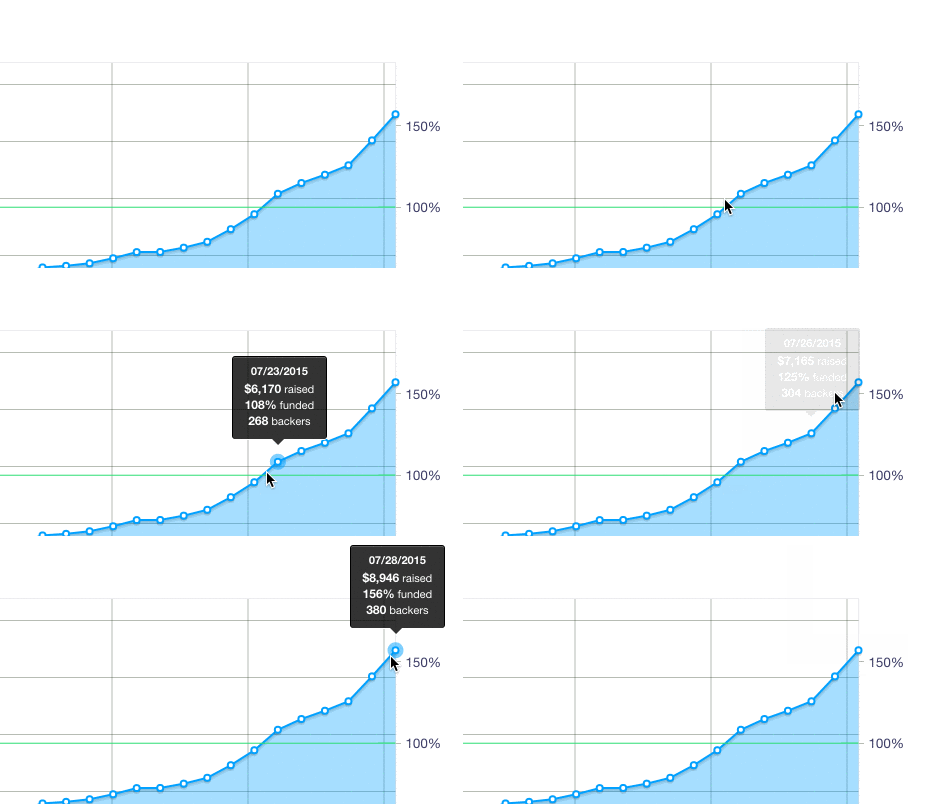
One phenomenon that I didn’t know about ahead of time is that many outlets won’t cover a Kickstarter campaign until after it’s fully funded. This is another reason you want to be funded as early as possible in the process. With this campaign, we were fully funded by end of day 7/22, with the campaign ending on 7/28:

backerlevels

I reached out to people who had told me to follow up when I was funded as soon as we met the goal, but six or seven days isn’t a lot of time for a news story turnaround on short notice – especially when that time stretches over a weekend (the 22nd was a Wednesday, the 28th was a Tuesday). So next time I do anything like this, the goal will be to get funded with a solid two weeks left (or more!), giving ample time for people to cover the campaign after it’s funded.

Reviews

Another route that I went, instead of just pitching people on writing about the campaign, was sending review copies to people who covered related topics. Not unsolicited, mind – I’d reach out via Twitter first and ask if they were interested in writing a review or just wanted to see it, and if they said yes, then I’d send it. Some of these people I was already engaging with; some I found via posting in Facebook groups or searching for people who tweeted about freelancing (or topics that freelancers often tweet about, like design or writing). I also openly posted on Facebook & Twitter that I’d send a review copy to anyone who wanted to write about it.

Here’s a few of the reviews or interviews that occurred as a result:

Product Hunt

Something I wanted to try with this Kickstarter was getting on Product Hunt. In case you haven’t heard of it, Product Hunt is like an aggregator of new/cool products and apps, with a massive audience (their  In other words, getting on the front page of Product Hunt is a really big deal.

I did have two factors working against me, though:

  1. About a month or two before my campaign started, I talked to one of the moderators, and she told me that they were putting less crowdfunding campaigns on the front page (which I totally understand as a community move, because in tech a lot of crowdfunding often results in broken promises and out-of-scope projects)
  2. I read a lot about “how to launch on PH” (as this is the preferred method of getting press for a lot of people in the tech/startup/blahblah world) and something that they didn’t mention is the entire “upcoming” page & the way it works

Basically, unless you’re in a select group of users, nothing you post goes on the front page. Instead, it goes on an upcoming page, that most people don’t check. Moderators can bump something from the upcoming page to the main page, but my understanding is that that doesn’t happen very often.

At any rate, I found myself with a Product Hunt invite/postable account. I asked a friend if she knew anyone who could post it, so she introduced me to someone who did, who didn’t post it, but instead invited me…it’s like the dang mafia up in here.

I posted it (and ran its own little mini-promotion campaign, with tweets linking to Product Hunt and prompts to backers to upvote it – read more on launching/promoting on Product Hunt here), but it stayed on the upcoming page for a day or two. Despite that, it still drove backers and traffic (see below).

Results:

Like I mentioned in the social media & content marketing recap, social media was far and away the biggest driver for backers. That said…

  • The Creative Bloq feature was #5 on the list of backer referrals, driving 6.43% of pledges (30 backers for a total of $575)
  • Product Hunt, despite not making it to the front page, still drove 3.3% of pledges (9 backers for a total of $295)
  • Other reviews and press added up to 2.57% of pledges (12 backers, $230)

Total: 12.3% (51 backers, $1,100)

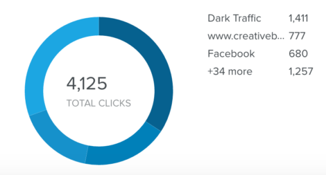
Now, like I mentioned before, depending on the link shortener used, shortened links can count as direct referral traffic…or links (shortened or not) that were opened in a new browser tab. (More on direct traffic here & here.) Looking at the referrals in the bit.ly dash, 19% of the clicks came from the CreativeBloq article (so it probably created more backers than the report shows).

Bitly__CB

All told, the press/PR/review efforts drove a decent amount of backers. There’s a few things I’d have done differently, but I’ll be covering those in a post at the end of the series.

Any questions? Hit me up on Twitter or leave a comment here – stay tuned for the next post (covering the exciting world of product design, manufacturing, shipping, and other admin!) and then the lessons learned/things to do differently next time wrap-up post (with resources). And if you haven’t read them already, you might want to check out the…

Other posts in the Kickstarter series:

Behind the scenes of a successful Kickstarter: everything you wanted to know (part one)

Kickstarter behind the scenes, part two: Marketing

1 2 3 20
Page 1 of 20